SERVICES
Lights Camera Discover is a nonprofit organization that provides underserved youth with opportunities to develop confidence, build self-esteem, and learn teamwork by participating in a series of workshops that teach various aspects of performing and digital arts.
The organization wanted to update their website to make it more informative while incorporating fresh branding that better represents their mission.
After chatting with the team at Lights Camera Discover, we decided that there were a few core values we really wanted to integrate into their logo design: the children served, the community, and the digital arts.
We also felt that due to the many ways they are likely to use this logo, it would better stand the test of time if it were a simple, abstract logo-icon rather than something more illustration or type focused.
With these two points in mind, we created an abstract logo that uses a simplified icon to represent an individual person, then we created a group of them together to represent a community. We also brought in the abstract shape of a camera aperture to represent the digital arts. This checked all our boxes for what we felt would give the strongest logo and we continued onto color exploration.
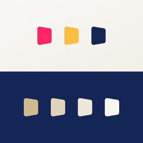
Colors are always a hard thing to tackle because they can be subjective and mean different things to different people. To avoid this subjectivity, it is a good idea to lay out a set of goals you want the colors to help achieve.
For this project, one of those goals was to have a color scheme that was bright and fun, as the company works with children. We also wanted these colors to fit on any employee and volunteer uniforms, banners or signage. However, we also didn’t want the colors to feel too child-like (ex: primary colors) for two main reasons:
1. LCD work with children of varying ages and with that age gap comes different tastes in color palettes and hues.
2. We wanted the company to look professional and appeal to the adults. After all, the parents will be the ones discovering and using the website to interact with LCD.
To achieve this, we mixed a few non-typical bright colors with slightly more muted, earthy toned calm colors. The rules for using these colors are to use bright colors for primary actions, dark blues for text, and the earthy tones for sub-information and background visuals.
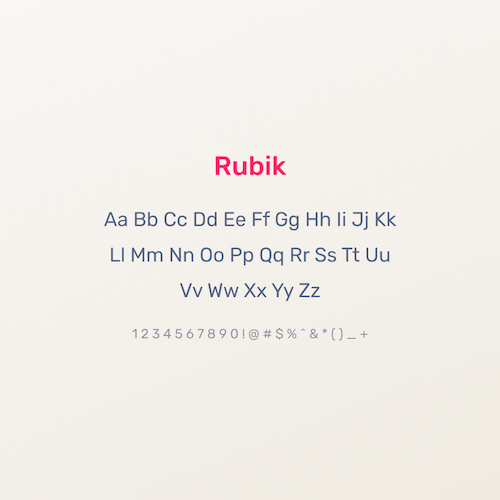
Another step that shares similar issues to choosing colors is typography. We wanted something fun and friendly, without going over the top and causing it to feel too child-focused.
We also didn’t want to break the bank buying unique fonts that can cost hundreds of dollars per font-weight.
To do this we used the free Google Font library and from that we chose Rubik. This is a modern, contemporary font with slightly rounded corners to look friendlier than a typical font. It is a subtle curve and matches the look we were striving for.
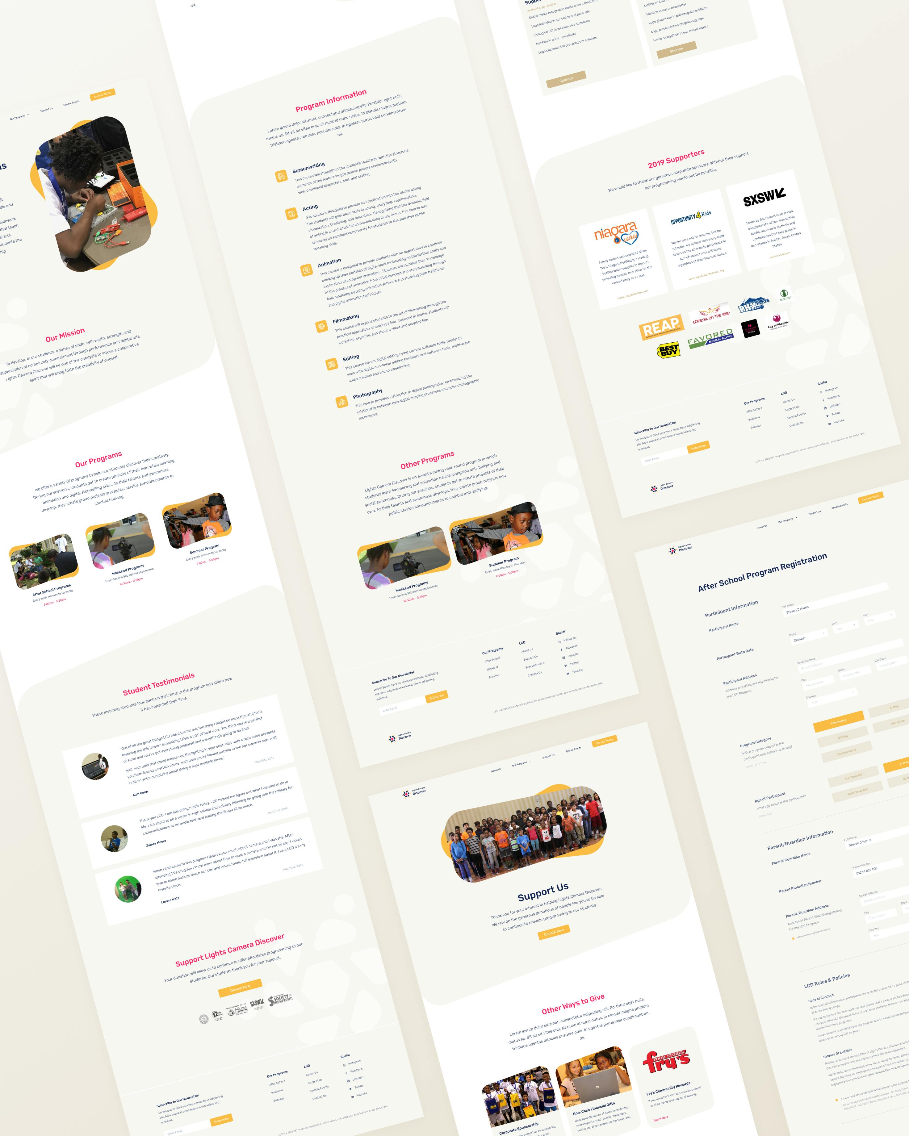
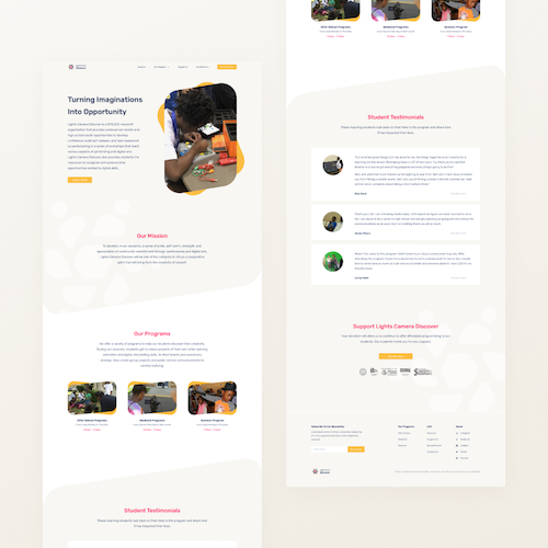
The original LCD Website had 6 pages total and an external donation page. However, they have multiple programs, none of which had their own informational page.
Keeping pages to a minimum is important, but we also understand that users want more information about events or programs before signing up. So, to keep the number of pages down but to provide the important information users want to see, we combined a lot of the original pages.
Things such as testimonials, programs, and sponsorships could now all move from their single pages to a joint page.
This not only keeps page count down but also increases the page value. Users do not have to click around the site but can instead find everything they need on one page.
We also designed a page for each of the programs LCD may be hosting. This allows them to give more information to users right away and will reduce the number of phone calls and emails they receive asking for such information.
As for the style of the website, we kept our previously mentioned color rules in place and added in some unique, “friendly” shapes to help keep things fun and interesting. This specific shape makes the page feel more creative and experimental, the exact sort of thing LCD explores within their classes.
"We are truly thankful for all of the hard work from the members of the Kuvio Creative team. We really appreciate all of their hard work. The communication with the team uncovered all of our needs and what we wanted to show on our site. The site came out really nice and we really like the flow of it. Thank you so much for working hard on all of our change requests and giving us what we asked for."
Kema Charles, Executive Director, Lights Camera Discover
By providing a new logo and branding along with a refreshed website design, we created an online presence for Lights Camera Discover that will help them to recruit new students and donors for years to come.
Note: Lights Camera Discover is a recipient of the Kuvio Create Impact Grant and services were provided at no cost. Learn more about the program here: www.kuv.io/grant
Hours of Design
Hours of Development
We believe in empowering you to be the best you can be, and we believe that the power of tech, design, and strong marketing can get you there. So let's get to work on your solution.